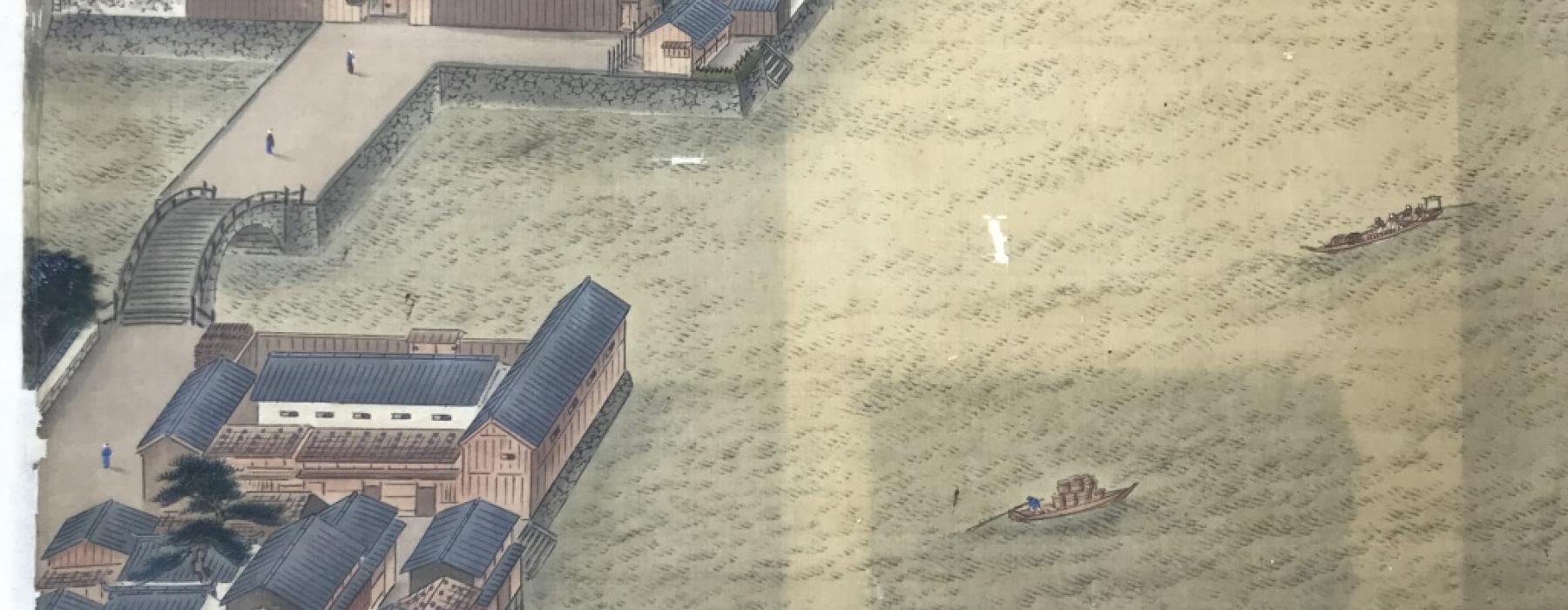
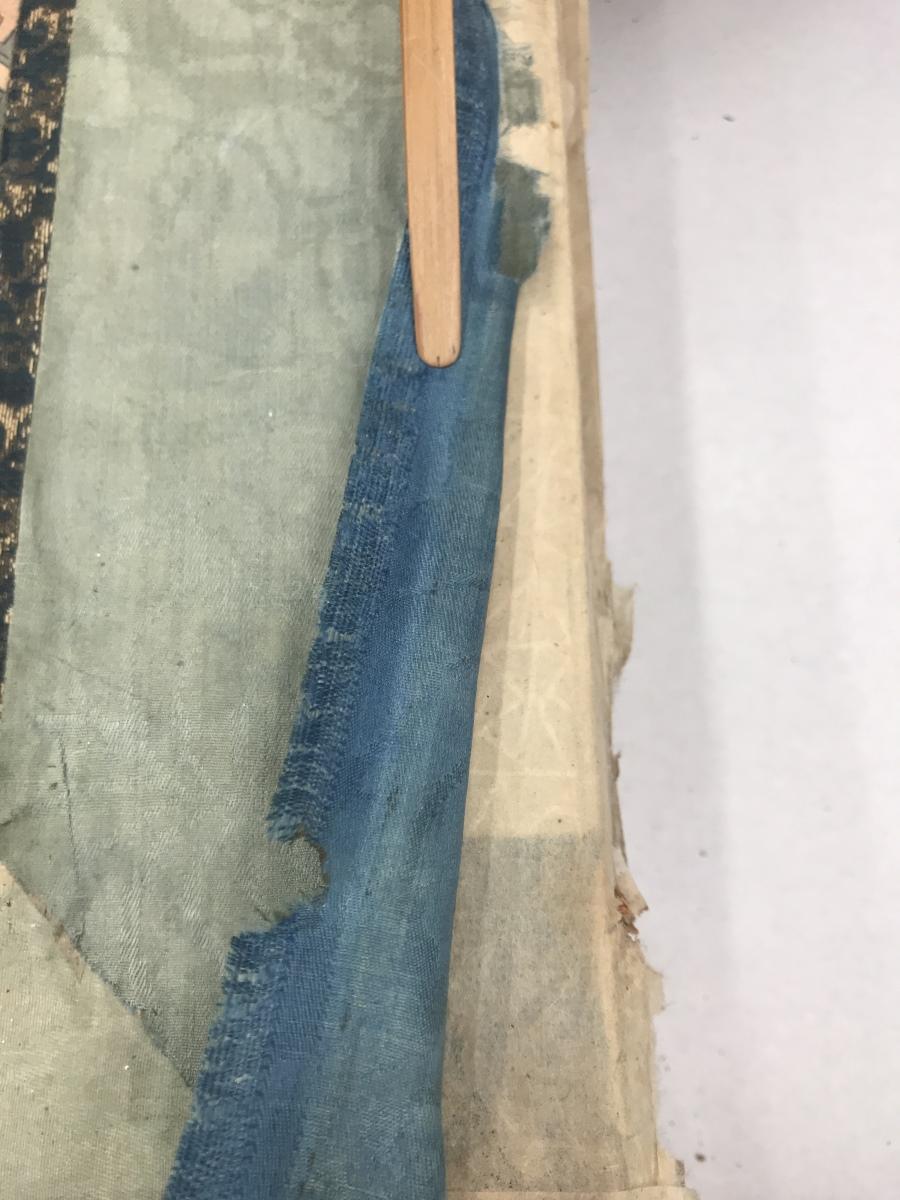
The blue colour of the sea and sky will not be retouched. That would conflict with current restoration ethics, which typically uphold the core principle of reversibility. Repainting or re-dyeing of the sections of silk from which the original blue has faded, would constitute a extensive and irreversible treatment. It is of course sensible to accept that time inevitably has its impact. However, the painting on this folding screen depicts a wide panorama over sea and sky, of which we know that blue was a predominant colour. Bringing back even a little bit of blue in the painting would considerably improve the readability of this masterpiece, and appear convincing to viewers once again.
Here, a partial solution presents itself. As per usual, the silk on which the painting is painted, is supported with two layers of thin Japanese lining paper of a neutral colour. This provides enough stability to the silk to be remounted onto the newly made folding screen. Despite the two layers of lining paper on the back of the painting silk, the lined painting is still somewhat translucent. This means that the colour of the new screen behind the paintings will have an effect on the overall appearance of this piece. The outer layers of the newly made screen are now white. This would have the effect of making the painting appear whiter overall, if it were attached to the screen as is. That is why we have carried out several tests to see what the effect would be of adding a third layer of lining paper, this one blue. The benefit of this approach is that applying a third layer of lining paper is reversible. If at any moment in the future this application is no longer appreciated, then it will be possible to reverse it, without having to treat the painting itself.
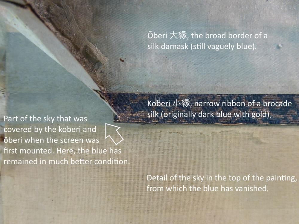
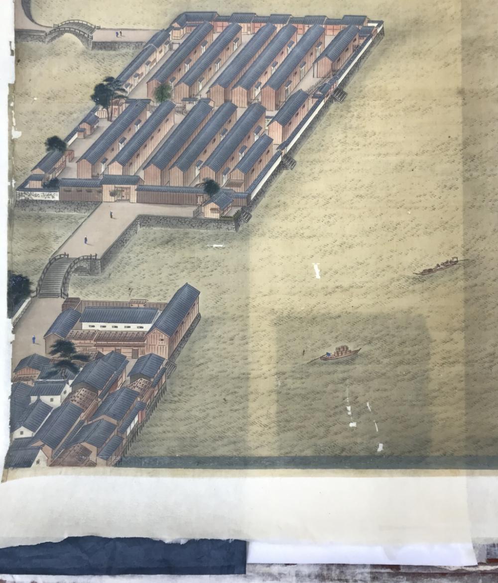
In the photo below, one of those tests is shown. From top to bottom, we see the sea around the square island with Chinese warehouses (see blog post 006); a small strip of dark blue sea of which the original colour has survived due to having been covered by the silk border; then two layers of neutral (beige/white) paper; and finally the ends of some strips of dark blue paper placed underneath the lined painting. The effect is actually quite strong. The colour of the blue sea approaches the original a little bit, and becomes more convincing. After several trials and consultation with Naoharu Usami, a lining paper of a lighter shade of blue was opted for. That gave, in the eyes of all involved, an even better balance between interfering as little as possible in the object, while enhancing its readability.
